Ewia is helping to create a waste-free society
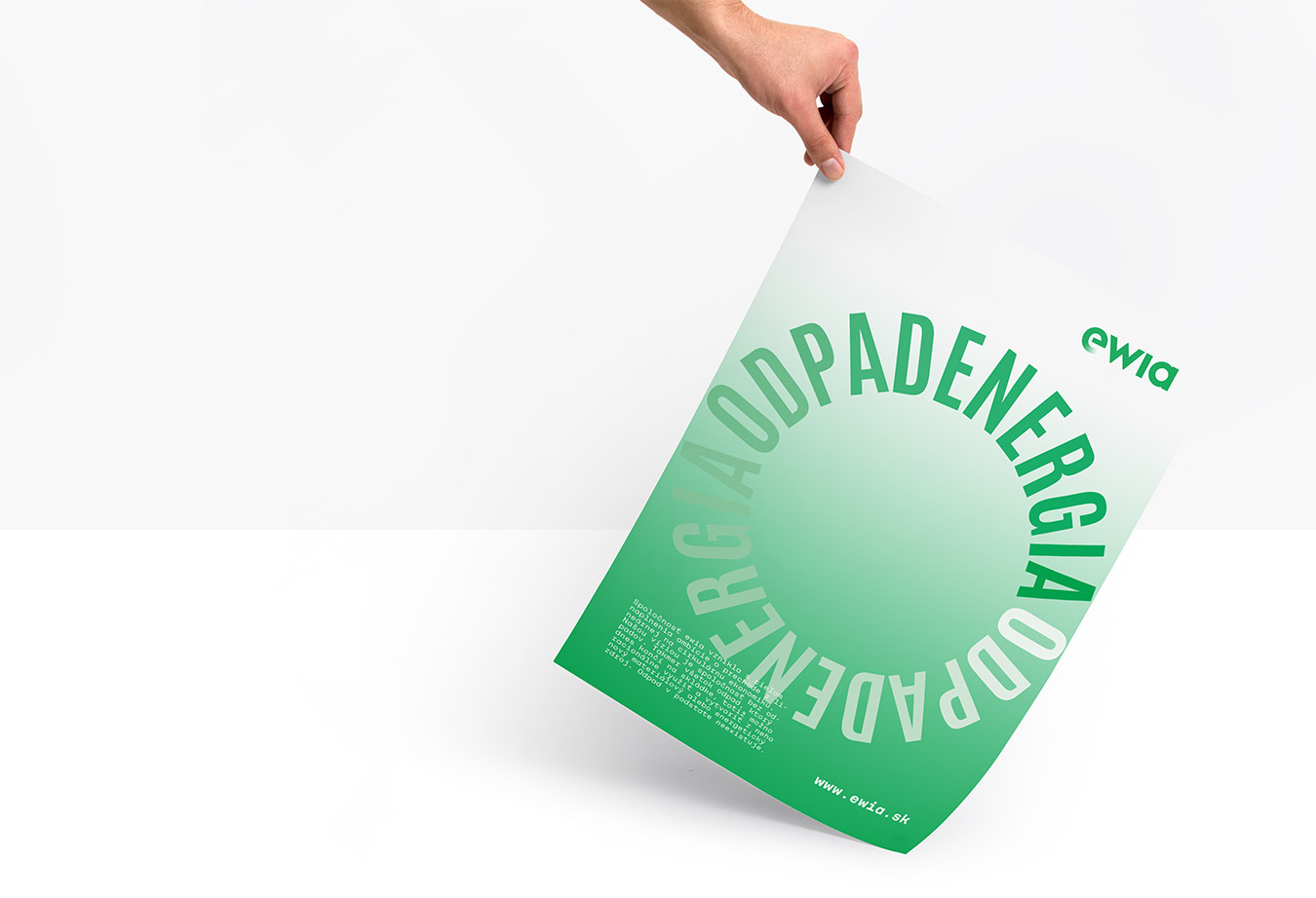
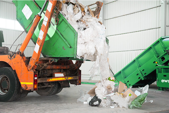
Majority of waste that ends up in landfills may be utilized
and converted to heat and energy. Waste would seize to
be the problem it is today. Ewia was created to bring this
change to Slovakia and help transition from linear to
circular economy. Investments worth EUR 600M prove
the fmagnitude of the plans. My job was to create the
visual identity.
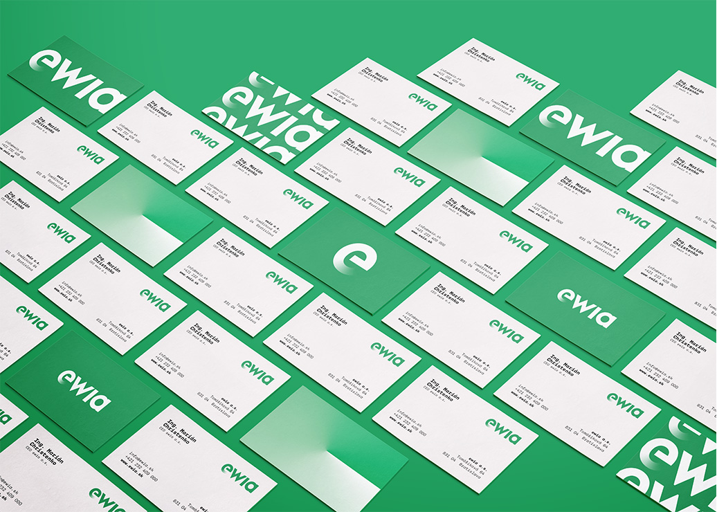

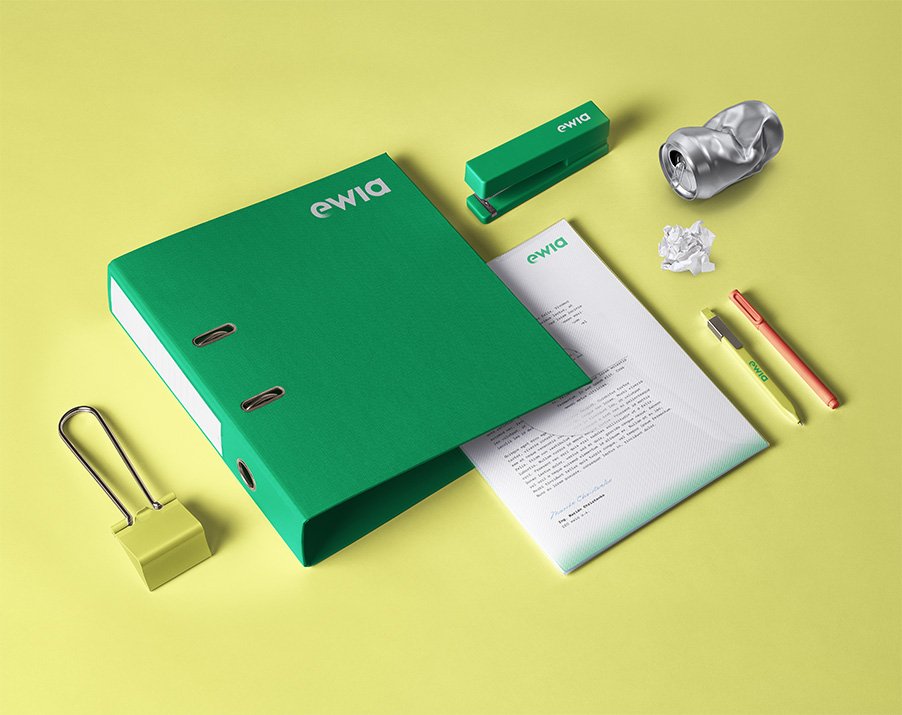
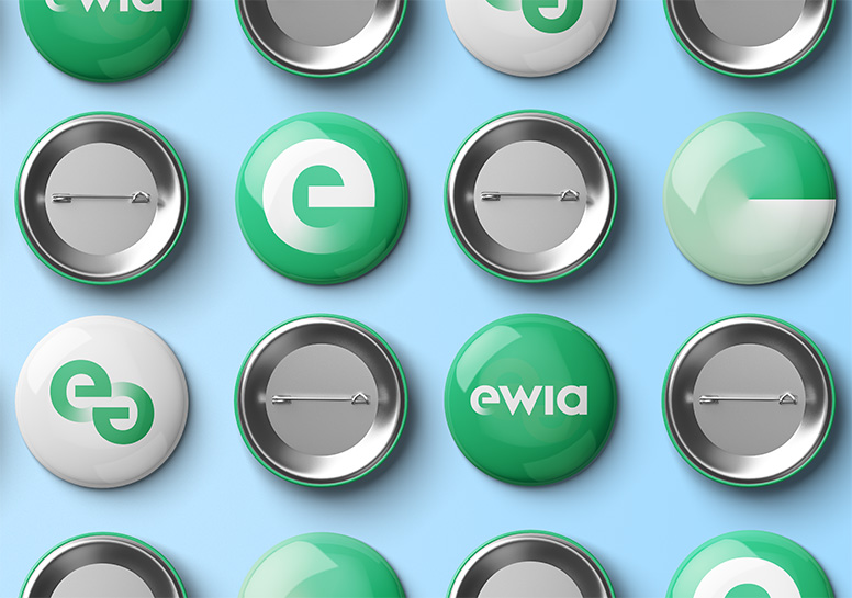
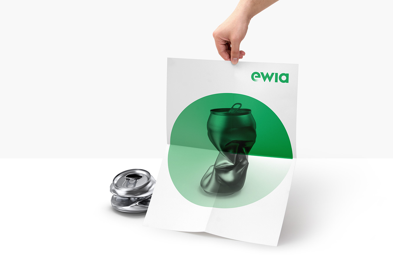
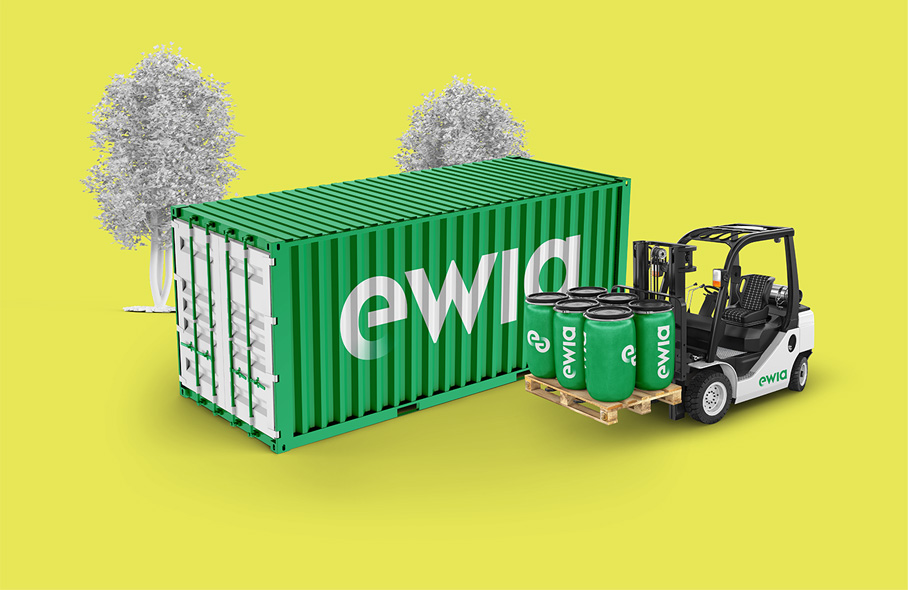
The essence of ewia's visual identity is the cycle represented
by the circle filled with a color gradient as a reference to the
sustainability and ecology of circular economy.
The circular gradient in the logotype creates an unconventional and unique brand perception. Just as the company brings innovation in the energy sector, innovative approach was essential while creating the visual communication.
The circular gradient in the logotype creates an unconventional and unique brand perception. Just as the company brings innovation in the energy sector, innovative approach was essential while creating the visual communication.
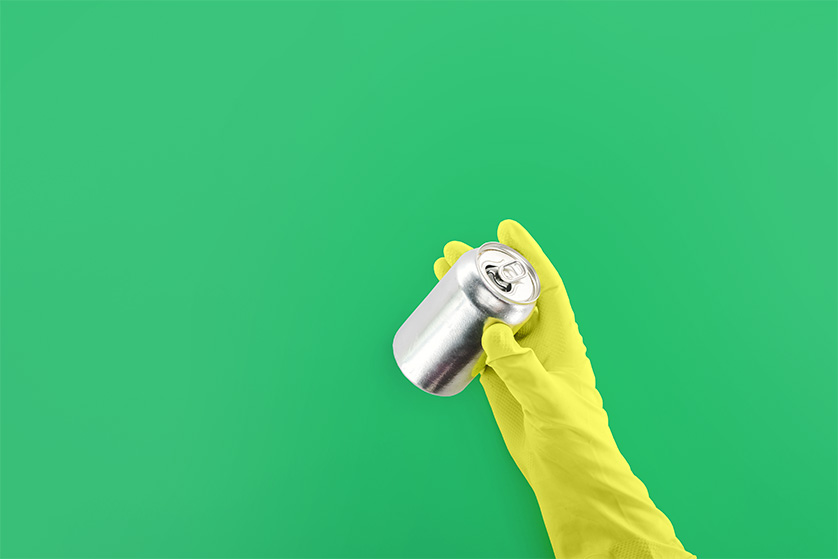
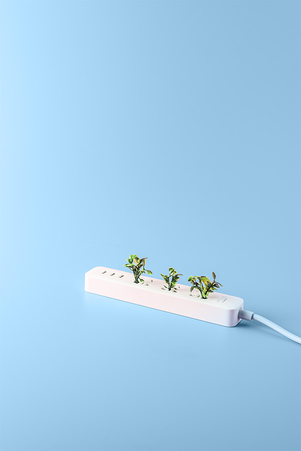
Ewia applies the latest trends in the field of circular
economy, so cleanliness and environmental
friendliness was a priority.
Color theory is based on the skin color that is in the middle and symbolizes man as part of nature and as an innovator. On one side is a color scale representing nature. Brown colors refer to natural and recycled materials. On the other, the color scale depicts human inventions as technology and energy. Shades of blue refer to technology and red and orange refer to fire and light.
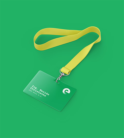
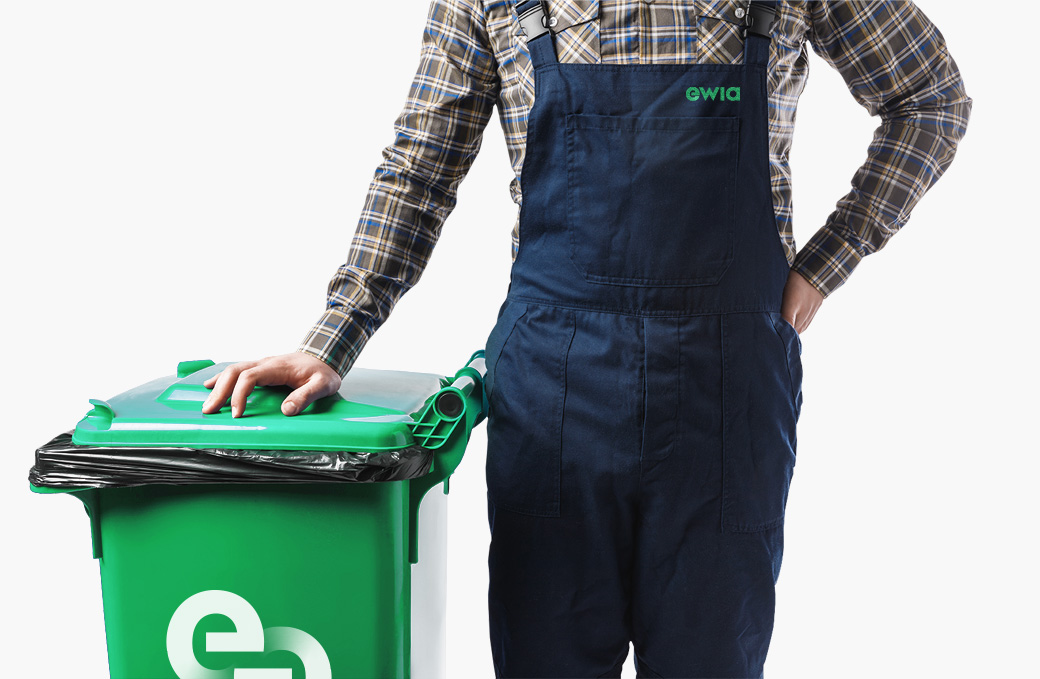
Every single detail in visual communication, from logotype, elements, fonts and colors have meaning and are part of a message carried by the brand.

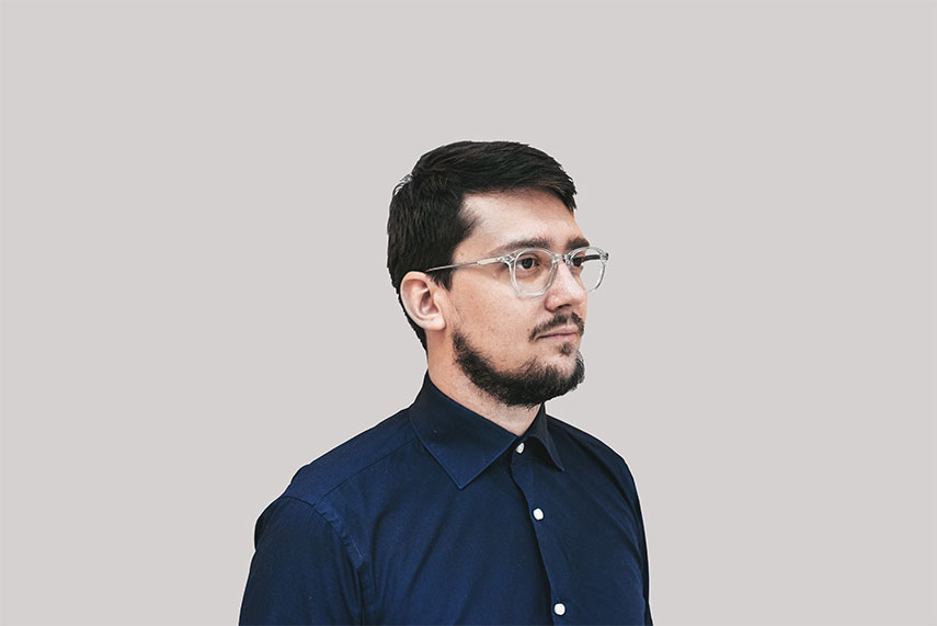
My name is Michal Slovák and I am a senior graphic designer
based in Slovak Republic. My specialties are branding and
packaging.
In my 9+ years of experience I have worked with companies from Honduras to California, from New York to Prague, from Bratislava to Melbourne.
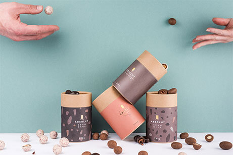
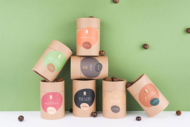
My design for LYRA Chocolate has won the Packaging of the Year 2017 Award for the best food packaging design in Czech and Slovak Republic and WorldStar Packaging Award. In 2018, the packaging design for Lyra Chocolate Naša Collection was awarded the Slovak National Design Award. In 2020, I was member of the international jury for Zlin Design Week. As of 2021 my designs have been printed on more than 40 million packages.
contact me
In my 9+ years of experience I have worked with companies from Honduras to California, from New York to Prague, from Bratislava to Melbourne.
My design for LYRA Chocolate has won the Packaging of the Year 2017 Award for the best food packaging design in Czech and Slovak Republic and WorldStar Packaging Award. In 2018, the packaging design for Lyra Chocolate Naša Collection was awarded the Slovak National Design Award. In 2020, I was member of the international jury for Zlin Design Week. As of 2021 my designs have been printed on more than 40 million packages.
I was featured on Dieline,
Packaging of the World,
Lovely package,
World Packaging Design,
DeTePe,
Sketcher,
Grafika,
Fičí SME,
interez,
Denník N and
Rádio Devín.
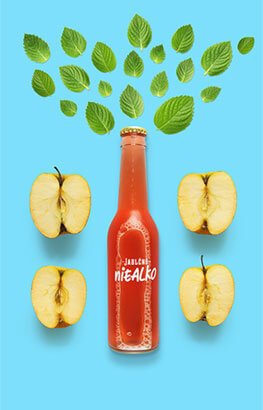
In 2013 I co-founded a beverage company Jablčnô
which produces genuine apple cider. We’ve been
featured on Forbes,
Trend and
HN.
contact me
